Thursday, 1 December 2011

Cities and Film


  • The city  Modernism
  • The possibility of an urban sociology
  • The city as a private space 
  • The city in post modernism
Georg Simmel

German sociologist- Told to lecture on the role of the social life in the city, but instead reverses idea and comments on the impact the city has on the individual.

Urban sociology. How the individual can exist in a space that is built on a group contribution. 
Engulfing the human figure, being swallowed up.

Architect Louis Sullivan- Creator of the modern sky scraper, form follows function. 

Guaranty building. Influenced by the arts and crafts movement- outside very ornate. The inside is very tightly organised. Basement mechanical zone, ground floor public zone, third zone office and fourth elevator equipment and small offices.

Skyscrapers represent the upward movement of business opportunity in New York.

Manhatta  Paul Strand an Charles Scheeler (1921)
Explore the relationship between camera movement and film. The figurine city, a small cog in a larger machine. 
Charles Scheeler photography- The city being a tall mechanical presence. Industrial landscape.

Fordism: mechanised labour relations. Maximum productivity in a minimal effort. Spew out standardised low cost goods. 

Modern times Charlie Chaplin (1936)
The body being consumed by the factory environment.

Stock market crash of 1929. Factories close and unemployment goes up dramatically. Those in factories mostly effected. 

Man with a movie camera (1929)
Silent movie. Famous for its range of cinematic techniques, split screens, close ups, stills, double exposure etc. Was invented within this film. 

Flaneur
Means a stroller, longer, saunter or loafer. Charles Baudelaire describes the role of the body in the city. A person who walks the city to experience it. He is just there to observe other people actions and interactions. Walter Benjamin adopts the concept of the urban observer as an analytical tool and as a lifestyle as seen in his writings. 

Photographer as flaneur. The flaneur finds the world picturesque. The female version- flaneuse. In the time that the idea of the flaneur was emerging women were not seen alone on the street. What we think of women on the street- either a bad woman or a prostitute.

Arbus/Hopper
A woman sitting alone in a cafe. A threat? The darkness that surrounds it has a depth to it, almost like the night is clinging to her. 

Sophie Calle (1980)
Creates a photographic piece of work about the flaneurs relationship with the city (Venice). Follows people without them knowing, documenting their journey. Somewhere between stalking and a love affair.
Venice- city of a labyrinth of narrow streets- you always end up where you began. 
The detective (1980) 
She gets her mother to hire a detective to follow her. Photographic document of her existence. Set in Paris. Ultimately controlled by her- she leads him around the city.

Cindy Sherman untitled film stills (1977-80)
Stereotypical view of the woman in the city. Low angle film points, skyscrapers behind characters- being swallowed up and overshadowed by the city.

Weegee (Arthur Felig)
See the dark side of New York. Follows around the emergency services, documenting them. Instantaneous reporting- kept  a portable dark room in his car s he could develop them quickly and go straight to the press.

The Naked City (1948)

LA Noir (2011)- video game. Challenges the player to control the LA police department. The city as simultaneously in the past and the present.
Bladerunner- made in 1982 depicting the city in 2019.

Walker Evans Many are called (1938)
Uses a hidden a camera, takes unobserved photographs. Intensely private moments. The idea of people being alone and separate in the city, despite being surrounded.

Post modern city on photography. Joel Meyerowitz.

9/11 citizen journalism. The end of the flaneur? Impossible to be a detached observer. The destruction of hte twin towers is the destruction of the American dream.
Adam Beezer 2001. Mobile phone images, replaces the idea of a journalist being sent to the scene- citizen journalism.
Surveillance city. Coming together of photography, film and the street.

Monday, 28 March 2011

Essay, re referenced.


Advertising doesn’tt sell things; all advertising does is change the way people think or feel (Jeremy Bullmore). Evaluate this statement with reference to selected critical theories.

It is hardly arguable that advertising is one of the most influential design medias in the western world; we are constantly bombarded by images promising our fantasies of a better life. We see an ideal of ourselves presented to us by the media and advertising, which demands we buy something to gain status in society; we react by thinking if we buy the product it will become a reality. It seeks to make people unhappy with their current possessions, and manipulates them into believing that the product makes the person, as Judith William states “Instead of being identified by what they produce, people are made to identify themselves because of what they consume” (Williamson, 1978). Consumption becomes an addiction and we find ourselves subconsciously following a false need, always having to have the latest, ‘newest’ product on the market. Commodities can also be seen as a shortcut to knowing who people are, we artificially feel closer to some people and further away from others because of their clothes and possessions. We conduct our relationships through objects or products and use them to ‘relate’ to other people, this dehumanizes society and makes material possessions more important than the actual person.

“In our urban world, in the streets where we walk and the buses we take and the magazines we read, on walls, on screens. We are surrounded by images of an alternative way of life.” (Berger, 1972) Whether consciously or not we take in these images that we are bombarded with in our everyday lives, promising us a brighter future. They demean our way of living, glamorizing products and consumerism. These images persuade us to buy something in a bid to make our lives in some way better, promising us happiness and wealth, although in doing so we’ll be poorer for having spent our money on otherwise worthless products. They show us people who have been transformed by these products, evoking in us envy, “This state of being envied is what constitutes glamour.” (Berger, 1972) We see our ideal selves in these images presented in the media and are envious of the fact, leading us to believe that if we buy the product it will make our ideals a reality.
“Oil paintings were surrounded by gold frames which symbolize the wealth of the owner within the picture and around it, what surrounds the publicity image is us, as we are.” (Berger, 1972) In the past people have used art and culture to show off status, now we use commodities. These advertisements, thrown out into the middle of our world, exclude us and leave much more to be desired. They belittle our lives as we know them and present to us our supposed ‘needs’ evoking in us a sense of longing for something better than the bleak world we live in.

“Products are shown in a favorable context, they encourage the viewer to associate their product with pleasant scenes, likeable characters. Romance, glamour and fun.” (Jacobson, 2006) Image and ideology are inherent factors in contemporary advertising, and when products are more subtly introduced to us, imbedded in motion pictures we are unaware of the impact they have on a subconscious level. Film audiences are easily definable when it comes to considering target market groups. Predominantly the age range of film goers tend to be from 15 to 34. Product placement in films also offers an outlet for products that are banned or discouraged from other, more conventional ways of advertising; such products include cigarettes and alcohol.
Imbedded advertising in film is often very subtle and few viewers are even aware that it exists. As Jacobson and Mazur state, “Imagine the impact of your customers seeing their favorite star using your product in a feature film. Both YOUR COMPANY’S NAME AND PRODUCT thereby become an integral part of the show, conveying both subliminal messages and implied endorsements.” (Jacobson, 2006) Films depict to us visions and variations of social realities; they are an apparatus for our own representations. This leaves us to interpret these ideologies as our own and subconsciously link them to products imbedded within these images.

The advertisement industry is also hugely influential towards children, sending them messages that they do not necessarily understand. “Research suggests that children under age 7 or 8 generally do not realize that ads are intended to persuade them to buy something. Younger children tend to think of ads as informal rather than persuasive.” (Alexander and Hoerrner, 2006)
Children are bombarded and overwhelmed by advertising messages from a young age. Very young children do not differentiate between program content and advertisements, finding it harder to distinguish between what is fact and what is being persuasive. They do not understand the distinctions between the real world and the ideal world being presented and cannot recognize deceptive and manipulative images, finding it hard to tell the difference between fantasy and reality. Another concern about advertisements aimed directly towards children, is the effect they have on their views towards commodities and material possessions. The American Psychological Association states that children are increasingly learning to be more materialistic and associate their self worth by what they own. “They are what they buy.” (Kunkel, 2002).


'The Uncle Sam Range' (1876) advertising image by Shumacher &Ettlinger, New York

This advertisement for ‘The Uncle Sam Range’ is an example of how imagery and subtle connotations are used to evoke people’s emotions and ‘need’ for something better. This image uses obvious symbols and stereotypes to brag of America’s greatness, which undermines other nations and makes them look primitive in comparison. It taps into people’s pride and longing to be the best, and to have the best. Every aspect of the image hints at America’s superiority over other nations. The entire set out of the image shows a typical ‘perfect’ family, as if by buying the range you are also buying the American dream. It is of course ridiculous to think that an oven can change your life, and make you some way superior to other people, or nations. But we buy into this thought; we buy into the thought of having something better. This not only undermines other nations, but it undermines everyone who views it, saying that there is always something more to be desired, this is what you want and how you want to be seen. “Advertisements are selling us something else besides consumer goods: in providing us with a structure in which we, and those goods, are interchangeable, they are selling us ourselves.”(Williamson, 1978) This quote speaks of how we do not buy the material product, but the idea of the product, the idea of it making us something more.


Victor Burgin’s Possession (1976)

This next image by Victor Burgin communicates a clear message, “7% of our population own 84% of our wealth”. Advertisements feed on this fact, and feed on capitalism. We buy things to make us feel richer, but in turn we are making ourselves poorer and them richer by spending money. Publicity persuades us that by buying something or having a certain product it will make us feel in some way wealthier and in turn make us feel happier. This makes people buy things that they do not necessarily need or want, giving us a superficial status and self-identity by the things we own. We use these possessions to express an idea that we have of ourselves, or how we want other people to see us, this arouses the question do we get to know people for whom they are or by our material possessions?

It seems that the advertising industry feeds solely on exploiting our emotions and uses this as a tool to get us to buy into whatever they may be selling. Although I have brought up many negative views and points about how we react to advertising and the media around us, it does benefit the economy by encouraging business and growth, although the majority of the wealth may be going to a small percentage of the world. Despite this I cannot help but feel that the advertising industry does nothing but tap into our insecurities, making us believe that possessions can actually change the way we feel and how happy we are with our lives. It brags of the virtues of commodities and demands we buy something to gain status in society, making us live in an ever-growing materialistic world. “We obviously do need these material goods. Advertising gives those goods a social meaning so that two needs are crossed, and neither is adequately fulfilled.” (Williamson, 1978) It appears that we are in a vicious circle between our need and want for material possessions.

Bibliography

Berger, J., 1972. Ways of seeing. London: Penguin.


Frith, K.T. ed., 1997. Undressing the Ad: Reading Culture in Advertising. New York: Peter Lang.


Pardun, C.J. ed., 2009. Advertising and Society: Controversies and Consequences. West Sussex: Blackwell.


Williamson, J., 1978. Decoding Advertisements: Ideology and Meaning in Advertising. London: Marion Boyars.


Theorists


Judith Williamson
John Berger
Michael F. Jacobson
A. Alexander & Keisha L. Hoerrner
Dennis Kunkel

Monday, 21 March 2011

Graphic Design & Deconstruction

 'Text from Lupton, E (2008) 'Thinking with Type'


  • Typography helps the reader to navigate their way around a piece of text, it helps them to avoid reading by skimming the text and skipping to the information that they are looking for.
  • Before print text was handwritten which meant that there were errors. Print meant that the text was finished and was unable to be edited by the reader; it meant the closure of the work making it a finished product. However online texts are downloadable, meaning the reader can now edit it, resulting in the typographer losing power over how the text is interpreted.
  • Language, when it is spoken has a continuous flow with no audible gaps. In type spacing and punctuation is crucial to translate speech.
  • Typography, acting as 'the crystal goblet' assumes the content of the text itself and changes it with each act of representation, being a mode of interpretation having huge power over the text. This means that how the text is used and presented is more important than what it means.
  • 'We may play the text, but it is also playing us'- meaning that however we try and interpret the text, type and layout plays a massive role in how it is read.
  • Typography, when made evident and ignoring the rules of 'the crystal goblet' illuminates the construction and identity of a page. When you can consciously see the rules and conventions of typography being broken it makes the reader realise the importance of them, and how much they influence the way we perceive a piece of text.
  • Text on screen has allowed typography to rise up out of the ashes. Computer display is more hospitable to text than film or television because of its physical proximity user control. Screen based text allows the reader to jump to other pages through links, skimming through information quickly and to download text, making it possible for them to edit it themselves.

These images by David Carson are key examples of deconstructionist graphic design. In the first image different fonts are used, even within one single header and the text is fragmented and seems to be thrown carelessly across the page. This makes it harder to read and takes more time to interpret what the text says. I think that there are two reactions when viewing a piece of graphic design like this, you either embrace it or dismiss it. Either way it is powerful in the way that it brings to light how the rules and conventions of typography influence how we read a spread. Although it is hard to read and may take some time, it is legible, so it doesn't necessarily make it 'bad' graphic design.
I particularly like the quote in the second image, 'Don't mistake legibility for communication'.This quote is emphasised by the scattered type surrounding it, which is ultimately illegible. What I think Carson is trying to communicate with this image is that just because text is legible or readable in the typical sense, doesn't mean that it is communicating to the reader in its full power. It is easy to block text off, following typical rules of layout, but is it communicating to the reader in its full potential, or just manipulating them to perceive the text in a certain way?


Monday, 21 February 2011

Deconstruction and Graphic design.

Emphasise an approach not a style.


Jacques Derrida.


Approach to texts that analyses their systems of representation- the systems which frame their communication.
Speech- from inside, primary. Interior, from the soul.
Writing- exterior to the mind, secondary. Absent subject.
Although writing carries your voice forever, maybe this is the more dominant, strong party?
Writing is an obvious copy of speech. Deconstruction changes the obvious.


Derrida tries to deconstruct.


Writing/ typography- communicates. Devices used to frame communication.


Reading Derrida's ideas, also reading the devises (rules of typography).


Text that is separated down the middle, but intended to read straight across from left to right. Questions the conventions and how you read.
You are constantly reminded that you are reading. You make your own meanings of the text- reminds you of normal constructions of the text- making you realise the possibilities of meaning and interpretation.


Structuralism vs post structuralism. 


Language and meaning of things can be interpreted by their structure- Semiotics.


Visible language, everything degrades.
Slowly changing structure in academic journal- to make you aware of the structure by deconstruction. Critique in the form that it is using.


Template Gothic- font by Barry Deck. Subtle unstable wobbly lines- looks geometric, but not. Unsettles the reader giving optical illusion. Forces you to think of the meaning of the layout- the graphic designer reappears.


Typography is there to control how you read. Deconstruction is liberating for the reader and is anti authority.


An attempt to show how the construction of text subconsciously effects the way you enterpret meaning.

Monday, 7 February 2011

In approximately 300 words discuss the concept of the 'Avant Garde' in relation to two examples of Graphic Design. Include pictures and full references to the works you are discussing

To be ‘Avant Garde’ is to be ahead of your time, to challenge current rules and conventions in both the world of fine art and graphic design. Although today, the term has been neutralized almost to the point of becoming meaningless, being loosely used to describe something as different or weird. I am going to attempt to find two examples of Avant Garde within graphic design.

http://www.satyamag.com/may05/lasn.html

 This ‘Brand Baby’ poster by Adbusters could be seen as Avant Garde because the message isn’t immediately clear. Its intent is also clearly to shock or puzzle the viewer. The way I interpret this image is that the branded world feeds on the teat of society.
You could say that this poster ignores modern conventions of graphic design, as graphic design is supposed to communicate a clear message or promote something, this image however does neither of these things. On the other hand, we are bombarded by images similar to this everyday, attempting to touch on some deep social meaning or issue. The question is, is this image meant to be interpreted or just confuse and arouse questions, thus being Avant Garde.

http://www.distortedesigners.com/forum/viewtopic.php?f=89&t=2257

‘Gorgeous isn’t good enough’. This image seems to comment on the need to be physically attractive in today’s society. The reason I chose this book cover as an example of Avant Garde graphic design is more about the image not the written message, which is relatively clear. There seems to be a contrast between image and message. Perhaps the imagery is hinting to surgery with all threads and stitching but personally I have no clue. The fact that I don’t understand this image arouses the question does it make it Avant Garde or bad Graphic Design? Or maybe I’m just part of a society too stupid to understand such strange conventions.

Personally I think you cannot be Avant Garde and a good graphic designer. A graphic designer's sole aim is to communicate a clear message, how can you do this if your audience is too ‘behind’ to understand? To ignore current conventions and rules is to fail as a graphic designer.

Avant-Garde

Avant-Garde emerges out of fine art.


What is art/ what is graphics?
Challenging, innovative, new, progressive.


Today- Avant-Garde is neutralised to the point of being meaningless- used in the terms of being weird, different.


Challenging conventions of what art is.
Anti establishment, anti conventional.
Non conformist.


Mocking the elitism of art, challenging what is art?


'Fauves' Wild Beasts. 
Self taught. Self portrait- person confronting you, challenging colours. Aggressive. To shock, reassess conventions. 


Content over style.


Experimental, unconventional. Personal creative identity- non conformist character.
Innovation, originality, creative genius.


Their is a hierarchy with art at the top- society values art more than design.
Concepts related to art are good and concepts related to design are perhaps ignored.


Art- taught by other artists, 'influenced' by them, copying them?


Historically art was taught by copying your teacher/ master. More like an apprentice than a student, poses the question, 'when are you your own artist?'
Art is not about originality when you are taught to copy, there is an illusion that you are innovative, different designers and artists.


Working to briefs. Jobs- doing what we're told. Not being creative- us as designers.


Death of Chatterton. The tortured artist.
Outside of society. The tortured poet, no one understands his poetry, cant sell. So Avant-Garde and ahead of society. We killed Chatterton with our closed minds, a martyr to art and our culture.


Art and design was never original, always copied or 'influenced'.
If everyone does it for the love, what do artists live on? Art is just as commercial as design.


To be Avant-Garde you have to be ahead of society, better than them, misunderstood. 
Being political, making a change or being better than todays society. Changing the world vs being above the world. 


Peasants building a road, why do we find this challenging? What makes art?


Art for art's sake. What artists think they're doing and what is actually being communicated. 'pure'. Independent example of where art/ society is going as opposed to politically pushing the world forward- the world follows the art. Politics over aesthetics?


Art is valued because of its institutional value, the amount of literature on art. Critics inventing reasons why art is important. Art has value because people write about the value of art.


Avant-Garde designers almost dont care about communication. Loses understandability for the sake of experimentation- failing in the purpose of your discipline?


What is Kitsch?
Inferior, lower quality, in bad taste, tacky, has a certain lovability but in a patronising way. Poor imitation of something.
Something that doesn't adhere to taste as you see it. Value judgement- an elitist thing to do, to call something kitsch. Elitist takes into account cultural standards, not personal taste.
Reproducing art tackily on a different medium. Culture/ society says we should only be moved by art, not china, tacky reproductions etc.
We are told what is kitsch. Determined by status, Jeff Koons Michael Jackson sculpture is art and not kitsch just because it's made by a famous artist.


Graphic design is not seen as important because it is not shown in galleries. But if it was the would it be art? not the role of graphic design. graphic design changes when inserted into galleries.


There are more possibilities for graphic design to be Avant-Garde now because people don't go to galleries. Graphic design doesn't try to be elitist.  


To be of the Avant-Garde is to be elitist.

Tuesday, 1 February 2011

Critical Positions on Advertising

Advertising- The most influential design media in the western world. In 90's estimate there are 11,000 ads every year, and an estimated 25 million different print ads in Britain every year. We cant get away from adverts.


John Berger- We are bombarded by images, promised fantasies, promised better lives which makes us unhappy with our current lives.


Marxism analysed capitalism, nothing specifically about advertising. Karl Marx 1818- 1883.


Ads demand we buy something to gain status in society. Buying clothes etc. for social status e.g. School uniform is a symbol of equality.


'The Stanley range' ad shows just the product, which shows it is sold on its own merit- the virtues of commodities. Commodities- thing that is designed to be sold.
We use commodities to express ourselves, or are we expressing an ideal of ourselves presented to us by the media?
Commodities are shortcuts to knowing who people are, they are a form of communication, we feel artificially closer to some people and further away from others.
Commodities- Idea of lifestyle, Cars and watches. Starbucks- pretending, superficial status. Apple- buying the status not the product.


What we buy is what we are, not our personality or skills etc. People don't measure themselves by what they  do for the world but by what they own.


'The Uncle Sam range'- selling the dream with symbolic association, is this a lie? 


Making something sexy and desirable- aesthetic innovation- becomes an addiction- addicted to consumption.
Anything that appears newer also creates false need- old products become inferior, companies know this and use it to sell more. They have the technology but produce less to promote the next.


The real nature of products is being hidden and disguised, this makes them seem more desirable.


Fetish- an object that is used to conduct a relationship through- using products, e.g. shoes to relate to people- dehumanises society.


Simplifying people into categories and stereotypes. Forget about the real nature of things- seems more magical.


In the past people (just the rich) used art and culture to show off status, now people use 
commodities.


Advertisements also benefits the economy- encourages business growth. 
Responsible of subsidising the media quality- creative and innovative graphic design- good at challenging stereotypes- good at perpetuating myths and bad stereotypes.


Ethics of ads are suspect- what can be marketed for children? Subjects- fast food, fizzy drinks... all harmful.


7% of our population owns 84% of our wealth- the ad and capitalism feed on that , the ad makes us poorer and them richer.

Sunday, 16 January 2011

Post modernist images

This image could be seen as post modern, because of the bold use of colours. It also follows no grid and the type seems to be quite random, in its ransom note style. 
Shrigley, D (2009) 'You cannot help looking at this'http://www.flickr.com/photos/39628616@N08/3760782743
I really like David Shrigley's work, and think that it takes on a very post modern sense of humour. It has no solid purpose except for being witty and funny.
Sagmeister, S (1997) 'AIGA biennial conference' http://aimeegd.wordpress.com/category/470-readings/
This piece goes against normal conventions of design, breaking the rules and using no grids. The aesthetic seems quite random and the use of handwritten text gives it a post modern element.
Sagmeister, S (1999) 'AIGA lecture poster' http://www.designboom.com/eng/interview/sagmeister.html
Sagmeister uses his own handwriting with no grids or guides, making it rough and original, following no solid aesthetic.
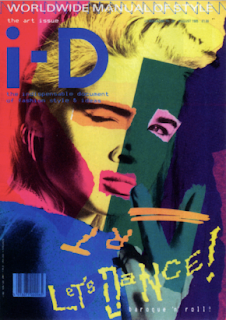
The bold colours and collage style used in this magazine cover, I think give a post modern style. The type is also free hand and quite rough and random.


Postmodernism

We live in a post modern era.

'Ironic'- key trait.
Sense of positivity: Art, design and culture. Building a utopia; better, positive world.

Rules of Modernism limiting (form follows function)

Modernism removes humanity, personality, originality.
MODERNISM: Experimental, purity, innovative, original, individual, serious.
POSTMODERNISM, characterised: Exhaustion, pluralism, pessism, dissillusionment, with the idea of absolute knowledge.
Not opposites, interelated.

Postmodernism: celebration of modernity, a response: negative, sarcastic reacts to modernism.
'Homeage to New York' Jean Tingley- Rebelion of modernity. Made of junk. Designed to destroy itself- no function, blowing up the modern world? No aesthetic considerations.

Starts to take shape in 60's

1960's beginning
1970's established as term (Jencks)
1980's recognised style
1980's & 90's dominant theoretical discourse
Now tired and simmering- post, postmodernist era?
  • after modernism
  • historical era following modernism
  • equivelant to 'late Capitalism' (Jameson)
  • artistic and stylisic eclecticism
  • 'global village' phenomena: globalisation of cultures, races, images, capital, products- world is reduced.
  • started by modernism railroads, telegram etc.
  • postmodernism interconnected world internet?
Modernism died 15th July 1972 3:32pm: Charles Jencks- demolition of Pruitt
Modernist building housing project- ghettos slums. Condensed people together- not a community.
to save American society after the war, the building was destroyed: symbol of failure of modernism, reality of modernism.

Postmodernism- started with idea that modernism is wrong, failed us.

Utopia & technological determinism: developement not always good for society, eg. Internet is good for the world but a chance for crime, stolen identity, porn etc.

Postmodernism- questionning conventions (especially those set by modernism).
Modernism: Equality, Postmodernism: Individuality

Postmodernism rejects rules and conventions- society gets confused so many options, too much choice.
Celebrate what has been discarded.

London- Postmodern city
New York- Modern city, form follows function

Makeover modern buildings. Sheffield Hill flats. AT&T building, Philip Johnson.
Mixing the old and new, takes seriousness of modernism away. Makes more human and fun. Refernce to old form of architecture made new... folly outside college failed, being 'ironic'.

New buildings that revive the past- postmodern reaction to ugliness of modernism.

Modernism is a lie... imposing visions in the rest of the world, ideaology, utopia. Entire communist society- impossible.

Totalising belief sysems. Crisis in confidence- dont know where wer going- Postmodernism, who am I? Splitered broken society- competing, people forming subcultures as opposed to a culture.

Robert Venturi... learning from Las Vegas- ultimate rejection of structured city.
Hybrid rather than pure.
For modernist Las Vegas represents destruction, degeneration of the world. Postmodernism celebrates this thought, out with modernism.

Advertising has more effect than fine art in postmodern world.

POSTMODERNITY
  • A vague disputed term.
  • Pomodernist attitude of questionning conventions.
  • Space for new voices.

New media and Visual Culture

Emergence of new technologies and the effect on visual culture.

'late age of print' Marshall Mcluhan: 'prophet' of electrical age. Foresaw the 'digital age'- different methods of communication, TV, radio, internet, mobile etc.

'Age of print' around 1450: Gutenbergs printing press- abled writing to be reproduced. Start of mass reproduction of literature. People can become educated, newspapers start.

Literate/ computerate. Important to be educated in 'computeracy'.

Computers- vehicle of consumption and product of communication.
The electronic book- reader takes on the role of the author. Challenges the power of the author. democratic, allows us to shape how we recieve information.
Reading newspapers online- different takes on the news by being read through different media.

Computer media: superficial style of reading. Lost in hyperspave. the illusion of not being able to get back to where you started.


Mass media. Small group of people controlling what everybody sees.
Not all of mass media is of low quality. Democratic potential- theatre, gigs, exhibitions can be accessed by millions, youtube. Mass spread.

John A Walker- Art in the age of mass media.

Superficial uncritical machine is alwaus standing between the audience and communicator- distanced. Audience is disempowered. Encourages the status quo- illusion that your'e part of a collective.
Phone ins- illusion of control. Encourages apathy, no control, cant change it.
Encourages escapeism, seen as a drug that aneasthetises us. Bland... Opium of the masses.

Benneton ads. Trading on images of death, horror- exposed AIDS.
Doing more than advertising, more political- not mindless- concrete effect.

Media and Art- Richard Hamilton.
Modern of mass culture.

Roy Lichenstein- showing comics ('trash') as something important. Mass production.

Critics dismiss media and pop art just the same- missing the point. Challenging superficiality, commercial essence of it all.

Warhol- Marilyn.
Celebrities are constructed and reproduced in the media.
Colours of product design, not art- anti-aesthetic.

Shocking images, once repeated lose shock value, disensitisation. Repetition causing numbness.

Modernist Images.

This Image uses the solid wedge shape that is used in many modernist images from this time. It uses bold block colours and also very importantly uses photography, which was very current at the time as photography was quite new, making this a modernist image, using modern technology.
Lissitzky, E (1919) 'Beat the Whites with the Red Wedge',http://www.designishistory.com/1920/el-lissitzky/
This image by Lissitzky is a very well known design from the modern era. The red wedge is a very prominent symbol of power and anti capitalism
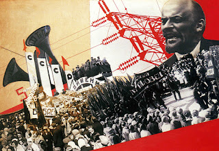
Stepanova, V (1932) 'The photomontage of Constructivism, from The Results of the First Five-Year Plan',http://www.flickr.com/photos/20745656@N00/573033730/
This image also merges photographic image with bold block colour. The colour red is very prominent, which is the colour of communism. 
This cover seems to be developed from Lissitzky's 'Beat the Whites with the Red Wedge'. It strongly shows the red wedge, a very powerful image. It is very simple and straight to the point, using straight lines and shapes with no needless decoration. The san serif font is also a  sign of modernist design.
A more current example of design that is influenced by modernism. Modernist design is not meant to discriminate, and should speak a language that everyone can understand. The image is powerful enough to speak for itself, making it a common language understood by all.


The Document

Documentary photography was the biggest form of photography in the 20th Century.
-Describes the photograph as a truthful representation of the world.


'Camera with a conscious'  to expose as well as to record. (James Nachtwey)


Photography- shows everyone the pain of war through images. Exposing war to benefit humanity. Photographer struggling for the people- erases the idea of photography being neutral.


Showing how the other half live- world being closed in on itself- photographer seeks to make viewer feel empathy.


Planned images- more than just a record, leans towards art- does the aesthetic involved make it less real?


Jacob Riis- social campaigner. Photographed squalor and poverty- hidden agenda?
Allowed the rich to spy on the poor.
Photographs are set and people are posing- fake representation?
Are they representing the peoples sense of self or how the photographer depicts them and intends to portray them.


Project FSA- government campaign to combat social crisis. Images used as an emotive lobbying tool- controversial. Photographers had an agenda, trying to make emotive images.


A photographer can stamp their representation on people or show their representations of themselves.
Subjects arranged like actors.


Blurring images becomes an aesthetic style to add dramatic effect- Capa Shudder.


All photographers have their own style and way to represent the world. 

Graphic Design... Medium for the masses.

Beginnings of visual communication
  •  Bison & Horses 15,000- 10,000 BC- cave paintings, signifiers for communication, no words
  • Betrayal 1305- Giotti Di Bondone, representing yourself, classical art but still shows visual communication
Graphic Design 1922- William Anderson Dwiggins
"this calls for an exercise in common sense"
-Early graphic design was a way of laying things out.

Richard Hollis
"The business of making or choosing marks and arranging them on a surface to convey an idea"
Has to have a messages directed at target audience.

Steven Heller- Graphic design and advertising go hand in hand

Henri De Toulouse-Lautrec
-Early stages of graphic design was very similar to fine art.
Visual communication- Proppaganda of the first and second world war.
  • Harry Beck 1931- 32- London Underground map
1937 BRITISH- Fine art, image and text. Graphic design stays very conservative.
Ludwig Vierthaler- degenerate art

SIMPLE

Sainsbury's classic cola- brand on Coca Cola... too close to Coke brand: people easily pick up on imagery, manages to sell because of similar branding.

  • Paul Rand - at the forefront of branding graphics.
  • Ken Garland  - First things first manifesto.
More to life than promoting, more to do than advertising: promote our trade, education, culture and greater awareness of the world.

TOUGH ECONOMY

  • Saul Bass- Hitchcock films: Classic graphic design
  • Post Modernism - Is the packaging just as important as the product?
  • David Carson - Ray Gun - Graphic design for graphic designs sake?... becomes an object of beauty? Dont mistake legibility for communication.