Reid, J (1977) 'God Save the Queen',http://www.theage.com.au/news/people/sex-pistols-sell-out/2006/03/10/1141701665565.html
This image could be seen as post modern, because of the bold use of colours. It also follows no grid and the type seems to be quite random, in its ransom note style.
Shrigley, D (2009) 'You cannot help looking at this'http://www.flickr.com/photos/39628616@N08/3760782743
I really like David Shrigley's work, and think that it takes on a very post modern sense of humour. It has no solid purpose except for being witty and funny.
This piece goes against normal conventions of design, breaking the rules and using no grids. The aesthetic seems quite random and the use of handwritten text gives it a post modern element.
Sagmeister uses his own handwriting with no grids or guides, making it rough and original, following no solid aesthetic.
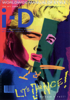
Jones, T(1980) 'I-D magazine cover'http://shanny12.wordpress.com/modernism-vs-postmodernism/
The bold colours and collage style used in this magazine cover, I think give a post modern style. The type is also free hand and quite rough and random.


No comments:
Post a Comment